
- Home
- Latest News
![submenu-img]() 'He used to call women to...': Woman shares ordeal in Prajwal Revanna alleged 'sex scandal' case
'He used to call women to...': Woman shares ordeal in Prajwal Revanna alleged 'sex scandal' case![submenu-img]() Mukesh Ambani, India’s richest man with over Rs 9603670000000 net worth, invites Pakistanis for…
Mukesh Ambani, India’s richest man with over Rs 9603670000000 net worth, invites Pakistanis for…![submenu-img]() You won't be able to board these trains from New Delhi Railway station, here's why
You won't be able to board these trains from New Delhi Railway station, here's why![submenu-img]() Meet IAS officer who is IIM grad, left bank job to crack UPSC exam, secured AIR...
Meet IAS officer who is IIM grad, left bank job to crack UPSC exam, secured AIR...![submenu-img]() Meet man, gets more than Rs 300 crore salary, accused of killing Google Search, he left Yahoo to…
Meet man, gets more than Rs 300 crore salary, accused of killing Google Search, he left Yahoo to…
- Election 2024
- Webstory
- IPL 2024
- DNA Verified
![submenu-img]() DNA Verified: Is CAA an anti-Muslim law? Centre terms news report as 'misleading'
DNA Verified: Is CAA an anti-Muslim law? Centre terms news report as 'misleading'![submenu-img]() DNA Verified: Lok Sabha Elections 2024 to be held on April 19? Know truth behind viral message
DNA Verified: Lok Sabha Elections 2024 to be held on April 19? Know truth behind viral message![submenu-img]() DNA Verified: Modi govt giving students free laptops under 'One Student One Laptop' scheme? Know truth here
DNA Verified: Modi govt giving students free laptops under 'One Student One Laptop' scheme? Know truth here![submenu-img]() DNA Verified: Shah Rukh Khan denies reports of his role in release of India's naval officers from Qatar
DNA Verified: Shah Rukh Khan denies reports of his role in release of India's naval officers from Qatar![submenu-img]() DNA Verified: Is govt providing Rs 1.6 lakh benefit to girls under PM Ladli Laxmi Yojana? Know truth
DNA Verified: Is govt providing Rs 1.6 lakh benefit to girls under PM Ladli Laxmi Yojana? Know truth
- DNA Her
- Photos
![submenu-img]() Remember Heyy Babyy's cute 'Angel' Juanna Sanghvi? 20 year-old looks unrecognisable now, fans say 'her comeback will...'
Remember Heyy Babyy's cute 'Angel' Juanna Sanghvi? 20 year-old looks unrecognisable now, fans say 'her comeback will...'![submenu-img]() In pics: Arti Singh stuns in red lehenga as she ties the knot with beau Dipak Chauhan in dreamy wedding
In pics: Arti Singh stuns in red lehenga as she ties the knot with beau Dipak Chauhan in dreamy wedding![submenu-img]() Actors who died due to cosmetic surgeries
Actors who died due to cosmetic surgeries![submenu-img]() See inside pics: Malayalam star Aparna Das' dreamy wedding with Manjummel Boys actor Deepak Parambol
See inside pics: Malayalam star Aparna Das' dreamy wedding with Manjummel Boys actor Deepak Parambol ![submenu-img]() In pics: Salman Khan, Alia Bhatt, Rekha, Neetu Kapoor attend grand premiere of Sanjay Leela Bhansali's Heeramandi
In pics: Salman Khan, Alia Bhatt, Rekha, Neetu Kapoor attend grand premiere of Sanjay Leela Bhansali's Heeramandi
- Explainers
![submenu-img]() DNA Explainer: Why Harvey Weinstein's rape conviction was overturned, will beleaguered Hollywood mogul get out of jail?
DNA Explainer: Why Harvey Weinstein's rape conviction was overturned, will beleaguered Hollywood mogul get out of jail?![submenu-img]() What is inheritance tax?
What is inheritance tax?![submenu-img]() DNA Explainer: What is cloud seeding which is blamed for wreaking havoc in Dubai?
DNA Explainer: What is cloud seeding which is blamed for wreaking havoc in Dubai?![submenu-img]() DNA Explainer: What is Israel's Arrow-3 defence system used to intercept Iran's missile attack?
DNA Explainer: What is Israel's Arrow-3 defence system used to intercept Iran's missile attack?![submenu-img]() DNA Explainer: How Iranian projectiles failed to breach iron-clad Israeli air defence
DNA Explainer: How Iranian projectiles failed to breach iron-clad Israeli air defence
- Entertainment
![submenu-img]() Meet actor, wasted 20 years in alcohol addiction, lost blockbuster to Salman, cult classic saved career at 49, now he...
Meet actor, wasted 20 years in alcohol addiction, lost blockbuster to Salman, cult classic saved career at 49, now he...![submenu-img]() Justin Bieber breaks down in tears amid rumours of split with wife Hailey in new pictures; concerned fans react
Justin Bieber breaks down in tears amid rumours of split with wife Hailey in new pictures; concerned fans react![submenu-img]() This film on AI had 'bizarre' orgasm scene, angry hero walked out, heroine got panic attacks, film grossed Rs 320 crore
This film on AI had 'bizarre' orgasm scene, angry hero walked out, heroine got panic attacks, film grossed Rs 320 crore![submenu-img]() This actor was only competition to Amitabh; bigger than Kapoors, Khans; quit films at peak to become sanyasi, died in..
This actor was only competition to Amitabh; bigger than Kapoors, Khans; quit films at peak to become sanyasi, died in..![submenu-img]() Meet actress who had no money for food, saw failed marriage, faced death due to illness, now charges Rs 1 crore a minute
Meet actress who had no money for food, saw failed marriage, faced death due to illness, now charges Rs 1 crore a minute
- Sports
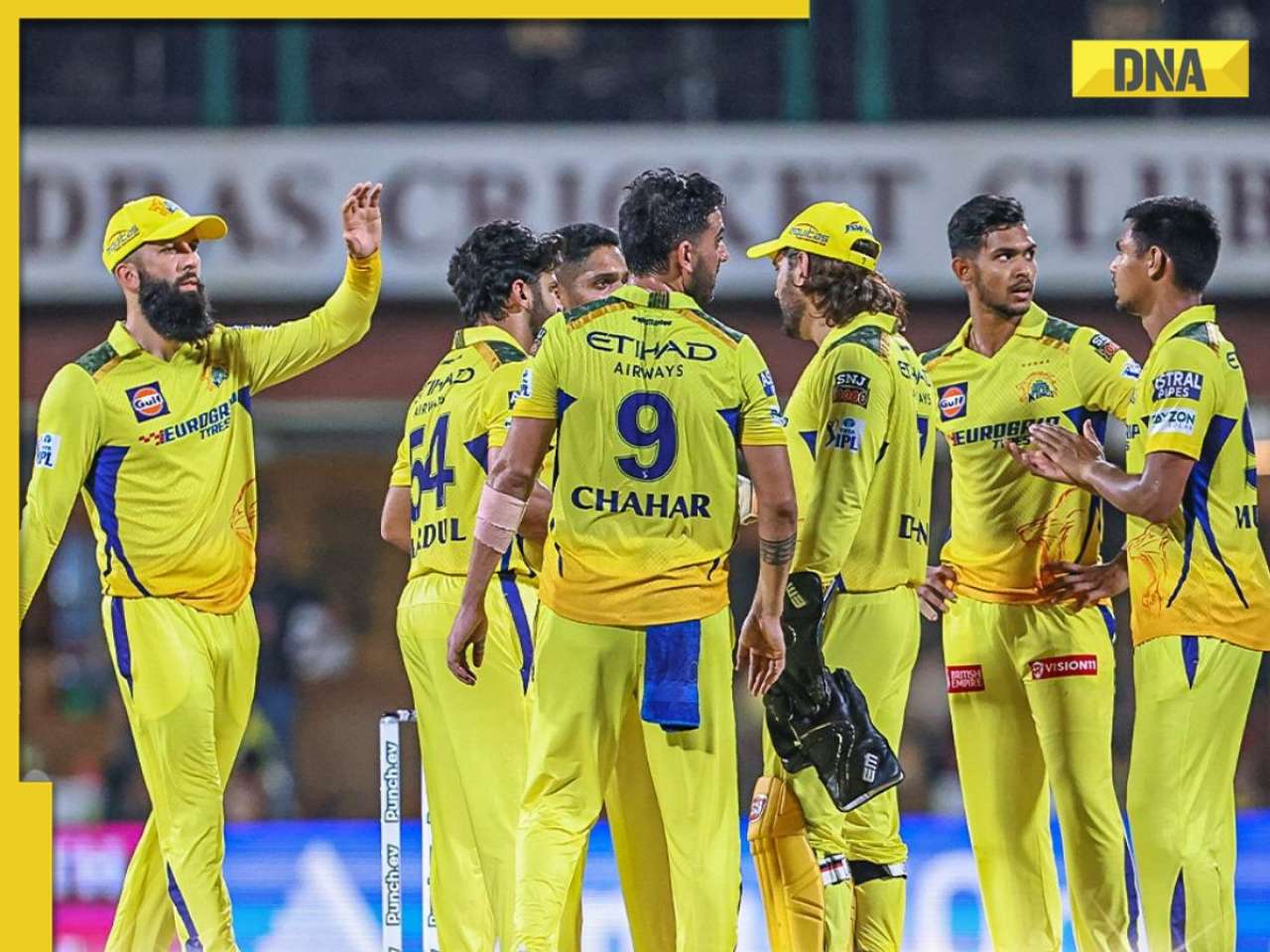
![submenu-img]() IPL 2024: Ruturaj Gaikwad, Tushar Deshpande power Chennai Super Kings to 78-run win over Sunrisers Hyderabad
IPL 2024: Ruturaj Gaikwad, Tushar Deshpande power Chennai Super Kings to 78-run win over Sunrisers Hyderabad![submenu-img]() IPL 2024 Points table, Orange and Purple Cap list after Royal Challengers Bengaluru beat GT by 9 wickets
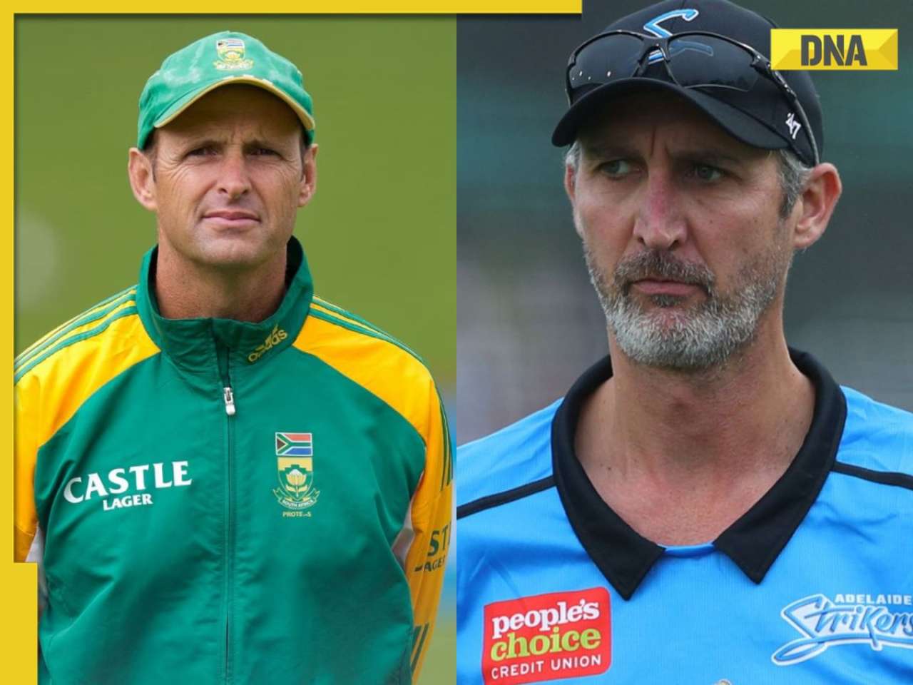
IPL 2024 Points table, Orange and Purple Cap list after Royal Challengers Bengaluru beat GT by 9 wickets![submenu-img]() PCB appoints Gary Kirsten and Jason Gillespie as head coaches ahead of T20 World Cup
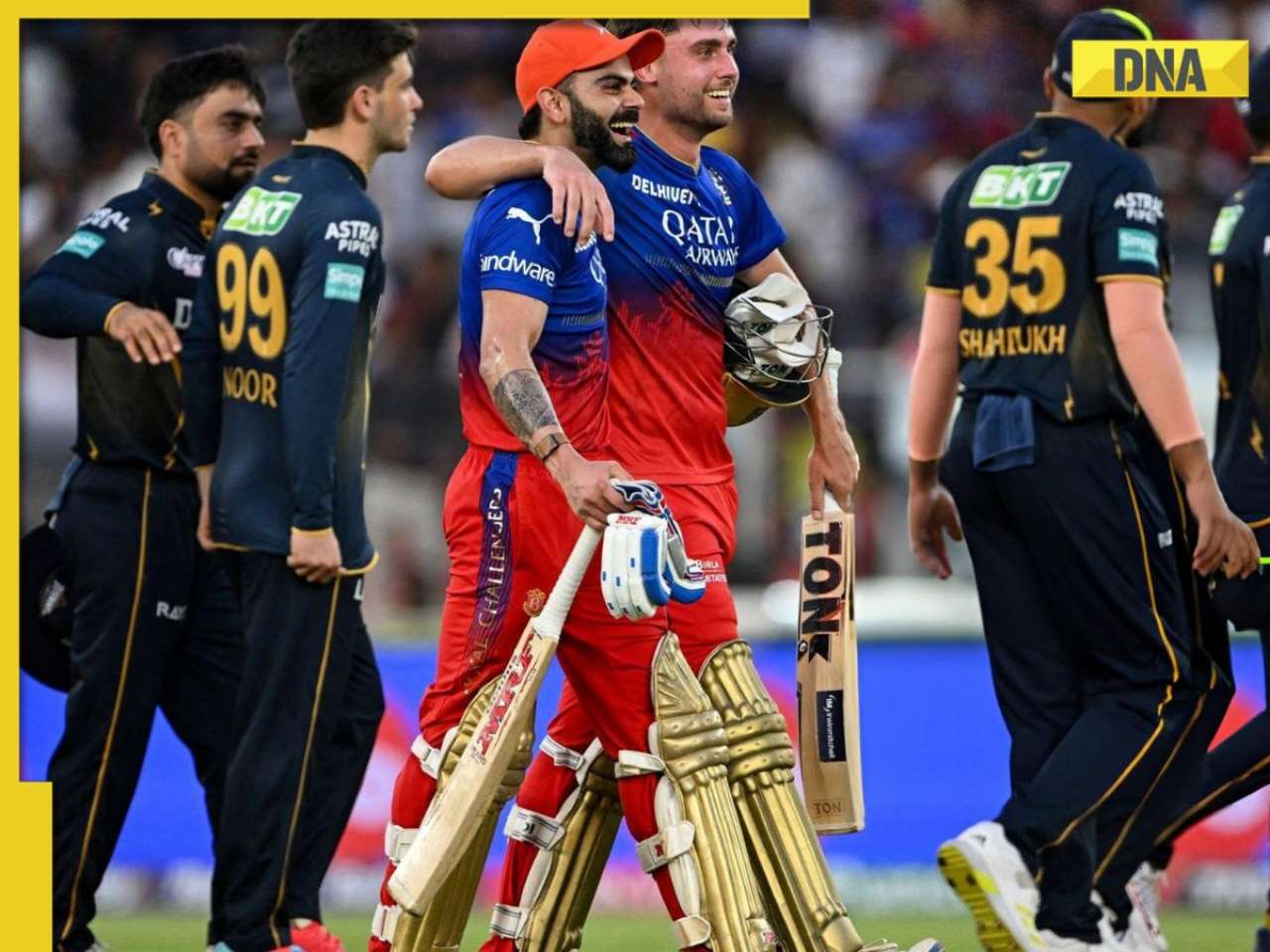
PCB appoints Gary Kirsten and Jason Gillespie as head coaches ahead of T20 World Cup![submenu-img]() IPL 2024: Will Jacks, Virat Kohli power Royal Challengers Bengaluru to big win against Gujarat Titans
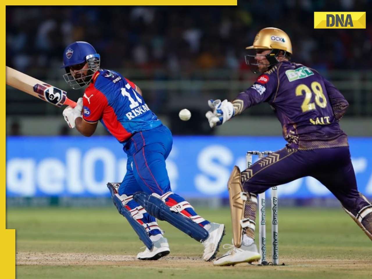
IPL 2024: Will Jacks, Virat Kohli power Royal Challengers Bengaluru to big win against Gujarat Titans![submenu-img]() DC vs KKR, IPL 2024: Predicted playing XI, live streaming details, weather and pitch report
DC vs KKR, IPL 2024: Predicted playing XI, live streaming details, weather and pitch report
- Viral News
![submenu-img]() Viral Video: 4 girls get into ugly fight on road, fly punches, pull hair; watch
Viral Video: 4 girls get into ugly fight on road, fly punches, pull hair; watch![submenu-img]() Private jets, pyramids and more: Indian-origin billionaire Ankur Jain marries ex-WWE star Erika Hammond in Egypt
Private jets, pyramids and more: Indian-origin billionaire Ankur Jain marries ex-WWE star Erika Hammond in Egypt![submenu-img]() Viral video captures mama tiger and cubs' playful time in Ranthambore, watch
Viral video captures mama tiger and cubs' playful time in Ranthambore, watch![submenu-img]() Heartwarming video of cat napping among puppies goes viral, watch
Heartwarming video of cat napping among puppies goes viral, watch![submenu-img]() Viral video: Man squeezes his body through tennis racquet, internet is stunned
Viral video: Man squeezes his body through tennis racquet, internet is stunned


 "New Android logo")


)
)
)
)
)
)