
- Home
- Latest News
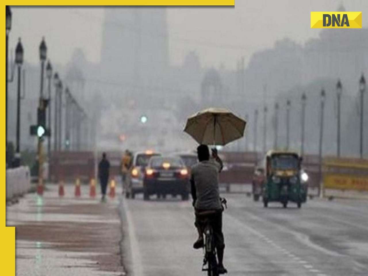
![submenu-img]() Weather update: IMD predicts light to moderate rain, thunderstorms in Delhi-NCR; check forecast here
Weather update: IMD predicts light to moderate rain, thunderstorms in Delhi-NCR; check forecast here![submenu-img]() 'I can't breathe': Black man in Ohio pleads as police officers pin him to floor, then...
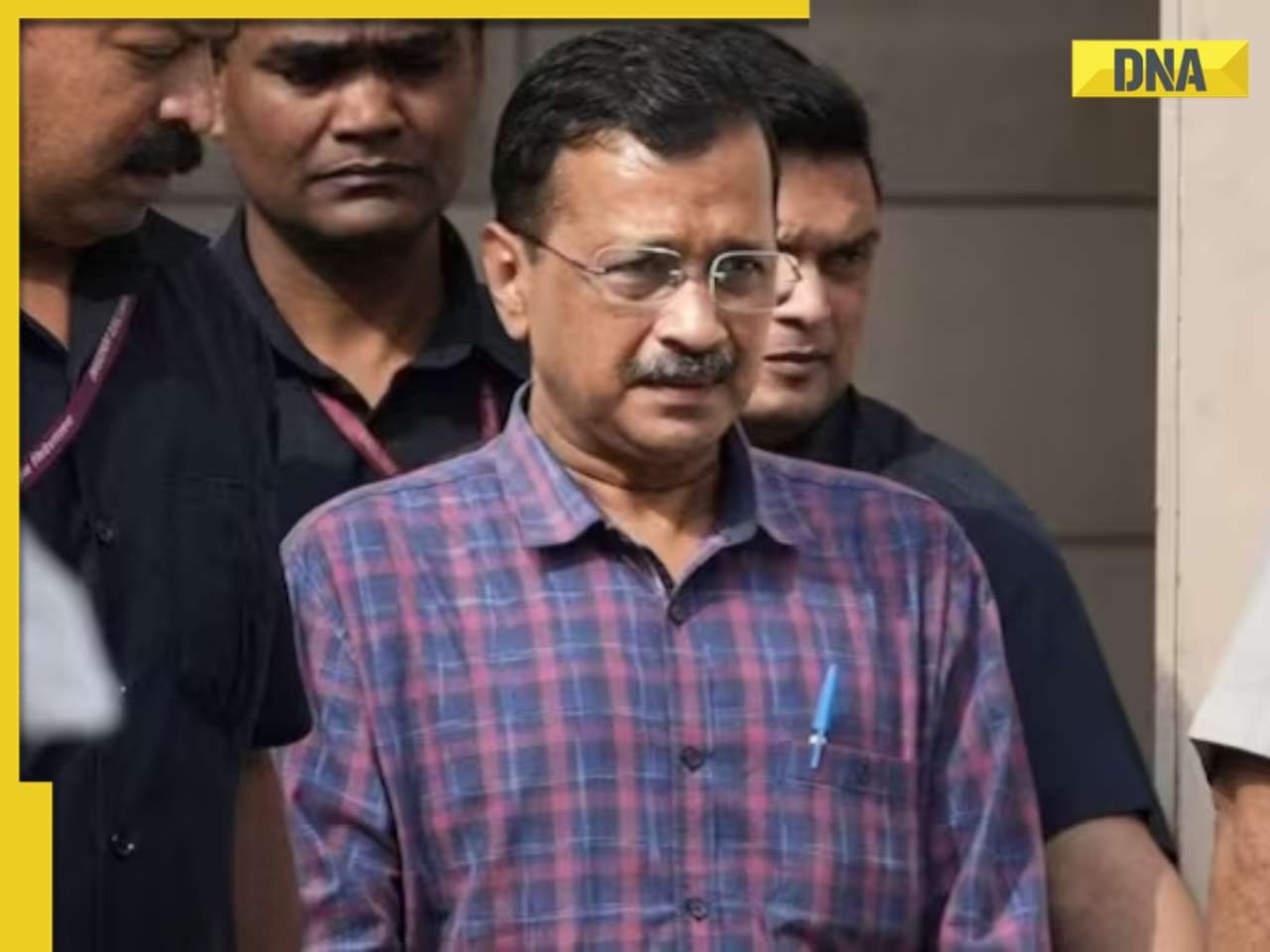
'I can't breathe': Black man in Ohio pleads as police officers pin him to floor, then...![submenu-img]() Delhi HC raps CM Kejriwal, accuses him of prioritising political interest by continuing as CM after arrest
Delhi HC raps CM Kejriwal, accuses him of prioritising political interest by continuing as CM after arrest![submenu-img]() Manipur: Two CRPF personnel killed in Kuki militants' attack in Naransena area
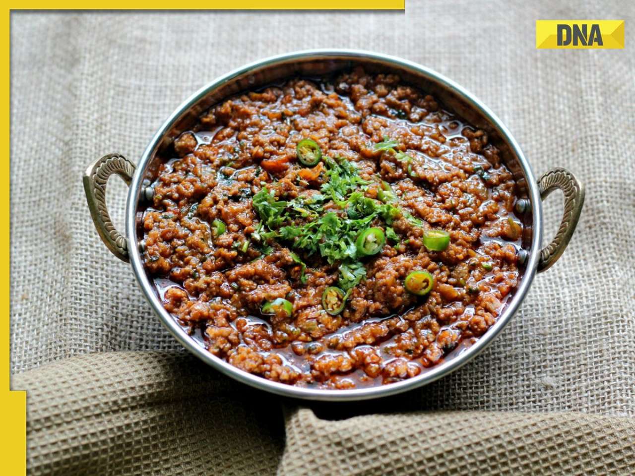
Manipur: Two CRPF personnel killed in Kuki militants' attack in Naransena area![submenu-img]() These 9 Indian dishes make it to the list of ‘best stews in the world’
These 9 Indian dishes make it to the list of ‘best stews in the world’
- Election 2024
- Webstory
- IPL 2024
- DNA Verified
![submenu-img]() DNA Verified: Is CAA an anti-Muslim law? Centre terms news report as 'misleading'
DNA Verified: Is CAA an anti-Muslim law? Centre terms news report as 'misleading'![submenu-img]() DNA Verified: Lok Sabha Elections 2024 to be held on April 19? Know truth behind viral message
DNA Verified: Lok Sabha Elections 2024 to be held on April 19? Know truth behind viral message![submenu-img]() DNA Verified: Modi govt giving students free laptops under 'One Student One Laptop' scheme? Know truth here
DNA Verified: Modi govt giving students free laptops under 'One Student One Laptop' scheme? Know truth here![submenu-img]() DNA Verified: Shah Rukh Khan denies reports of his role in release of India's naval officers from Qatar
DNA Verified: Shah Rukh Khan denies reports of his role in release of India's naval officers from Qatar![submenu-img]() DNA Verified: Is govt providing Rs 1.6 lakh benefit to girls under PM Ladli Laxmi Yojana? Know truth
DNA Verified: Is govt providing Rs 1.6 lakh benefit to girls under PM Ladli Laxmi Yojana? Know truth
- DNA Her
- Photos
![submenu-img]() In pics: Arti Singh stuns in red lehenga as she ties the knot with beau Dipak Chauhan in dreamy wedding
In pics: Arti Singh stuns in red lehenga as she ties the knot with beau Dipak Chauhan in dreamy wedding![submenu-img]() Actors who died due to cosmetic surgeries
Actors who died due to cosmetic surgeries![submenu-img]() See inside pics: Malayalam star Aparna Das' dreamy wedding with Manjummel Boys actor Deepak Parambol
See inside pics: Malayalam star Aparna Das' dreamy wedding with Manjummel Boys actor Deepak Parambol ![submenu-img]() In pics: Salman Khan, Alia Bhatt, Rekha, Neetu Kapoor attend grand premiere of Sanjay Leela Bhansali's Heeramandi
In pics: Salman Khan, Alia Bhatt, Rekha, Neetu Kapoor attend grand premiere of Sanjay Leela Bhansali's Heeramandi![submenu-img]() Streaming This Week: Crakk, Tillu Square, Ranneeti, Dil Dosti Dilemma, latest OTT releases to binge-watch
Streaming This Week: Crakk, Tillu Square, Ranneeti, Dil Dosti Dilemma, latest OTT releases to binge-watch
- Explainers
![submenu-img]() DNA Explainer: Why Harvey Weinstein's rape conviction was overturned, will beleaguered Hollywood mogul get out of jail?
DNA Explainer: Why Harvey Weinstein's rape conviction was overturned, will beleaguered Hollywood mogul get out of jail?![submenu-img]() What is inheritance tax?
What is inheritance tax?![submenu-img]() DNA Explainer: What is cloud seeding which is blamed for wreaking havoc in Dubai?
DNA Explainer: What is cloud seeding which is blamed for wreaking havoc in Dubai?![submenu-img]() DNA Explainer: What is Israel's Arrow-3 defence system used to intercept Iran's missile attack?
DNA Explainer: What is Israel's Arrow-3 defence system used to intercept Iran's missile attack?![submenu-img]() DNA Explainer: How Iranian projectiles failed to breach iron-clad Israeli air defence
DNA Explainer: How Iranian projectiles failed to breach iron-clad Israeli air defence
- Entertainment
![submenu-img]() Krishna Mukherjee accuses Shubh Shagun producer of harassing, threatening her: ‘I was changing clothes when...'
Krishna Mukherjee accuses Shubh Shagun producer of harassing, threatening her: ‘I was changing clothes when...'![submenu-img]() Meet 90s top Bollywood actress, who gave hits with Shah Rukh, Salman, Aamir, one mistake ended career; has now become…
Meet 90s top Bollywood actress, who gave hits with Shah Rukh, Salman, Aamir, one mistake ended career; has now become…![submenu-img]() This actress, who once worked as pre-school teacher, changed diapers, later gave six Rs 100-crore films; is now worth…
This actress, who once worked as pre-school teacher, changed diapers, later gave six Rs 100-crore films; is now worth…![submenu-img]() 'There were days when I didn't want to probably live': Adhyayan Suman opens up on rough patch in his career
'There were days when I didn't want to probably live': Adhyayan Suman opens up on rough patch in his career![submenu-img]() This low-budget film with no star is 2024's highest-grossing Indian film; beat Fighter, Shaitaan, Bade Miyan Chote Miyan
This low-budget film with no star is 2024's highest-grossing Indian film; beat Fighter, Shaitaan, Bade Miyan Chote Miyan
- Sports
![submenu-img]() World wrestling body threatens to reimpose ban on WFI if...
World wrestling body threatens to reimpose ban on WFI if...![submenu-img]() IPL 2024: Jonny Bairstow, Shashank Singh special power Punjab Kings to record run-chase against KKR
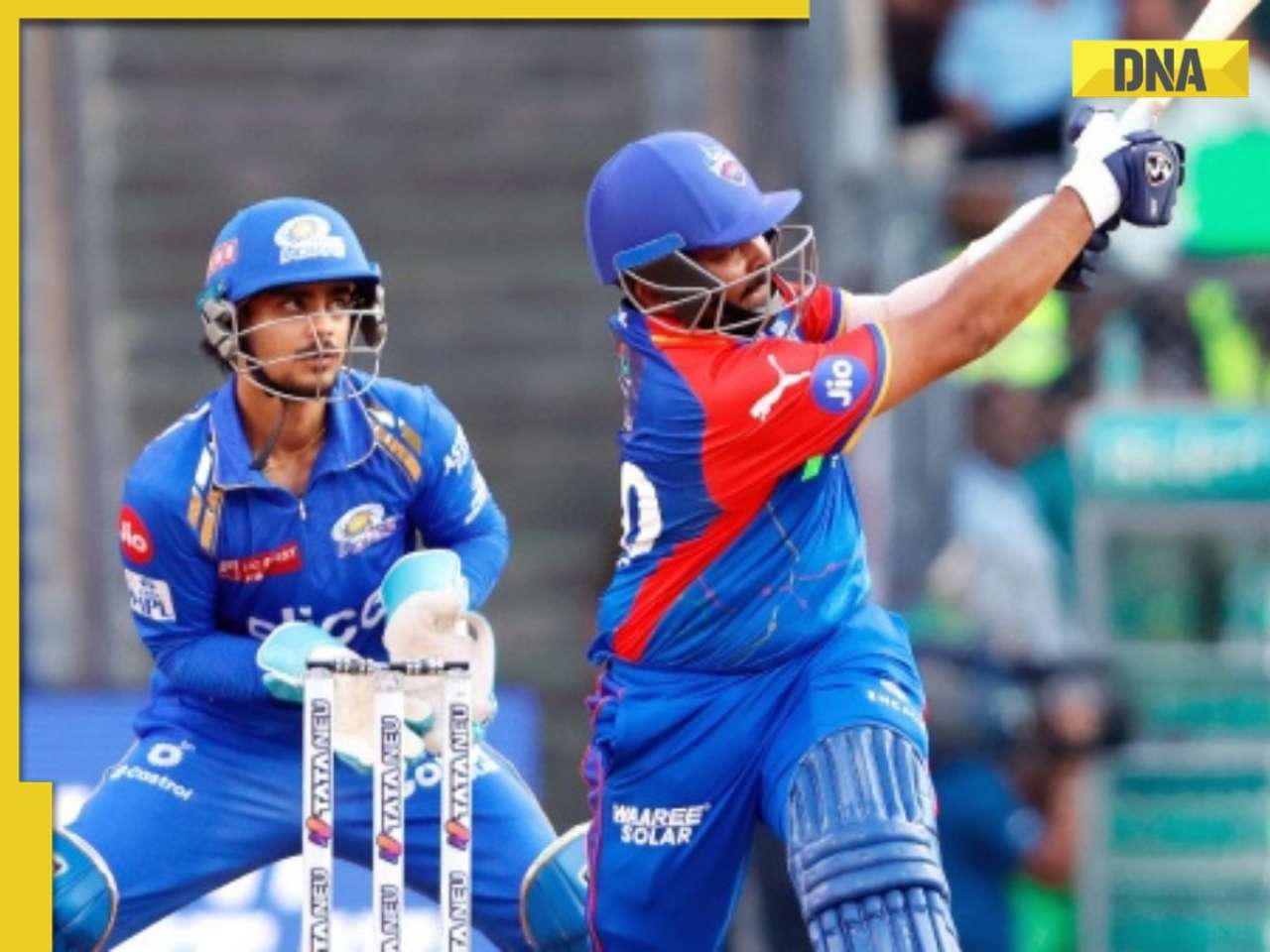
IPL 2024: Jonny Bairstow, Shashank Singh special power Punjab Kings to record run-chase against KKR![submenu-img]() DC vs MI, IPL 2024: Predicted playing XI, live streaming details, weather and pitch report
DC vs MI, IPL 2024: Predicted playing XI, live streaming details, weather and pitch report![submenu-img]() DC vs MI IPL 2024 Dream11 prediction: Fantasy cricket tips for Delhi Capitals vs Mumbai Indians
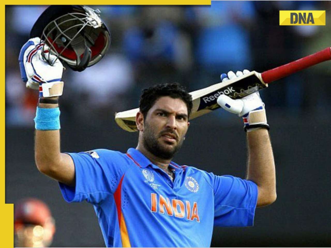
DC vs MI IPL 2024 Dream11 prediction: Fantasy cricket tips for Delhi Capitals vs Mumbai Indians![submenu-img]() Yuvraj Singh named ICC Men's T20 World Cup 2024 Ambassador
Yuvraj Singh named ICC Men's T20 World Cup 2024 Ambassador
- Viral News
![submenu-img]() Watch: Lioness teaches cubs to climb tree, adorable video goes viral
Watch: Lioness teaches cubs to climb tree, adorable video goes viral![submenu-img]() Viral video: Little girl's impressive lion roar wins hearts on internet, watch
Viral video: Little girl's impressive lion roar wins hearts on internet, watch![submenu-img]() Who is Sangeet Singh? Man arrested for posing as Singapore Airlines pilot at Delhi airport
Who is Sangeet Singh? Man arrested for posing as Singapore Airlines pilot at Delhi airport![submenu-img]() One of India’s most expensive wedding, attended by 5000 people, 100 room villa, cost Rs…
One of India’s most expensive wedding, attended by 5000 people, 100 room villa, cost Rs…![submenu-img]() Viral video: Delhi's 'Spiderman' take to streets on bike, get arrested; watch
Viral video: Delhi's 'Spiderman' take to streets on bike, get arrested; watch


 "Lamborghini")


)
)
)
)
)
)