
- Home
- Latest News
![submenu-img]() Sonam Kapoor says she gained 32 kg during pregnancy, was traumatised: 'Never going to feel the same'
Sonam Kapoor says she gained 32 kg during pregnancy, was traumatised: 'Never going to feel the same'![submenu-img]() Weather updates: IMD issues severe heatwave condition in these states; check forecast here
Weather updates: IMD issues severe heatwave condition in these states; check forecast here![submenu-img]() Sahil Khan detained by Mumbai SIT in Mahadev betting app case
Sahil Khan detained by Mumbai SIT in Mahadev betting app case![submenu-img]() Bank Holidays in May 2024: Branches to remain closed for 10 days this month, check full list
Bank Holidays in May 2024: Branches to remain closed for 10 days this month, check full list![submenu-img]() Govinda had tears in his eyes on seeing Arti Singh as bride, Krushna Abhishek reveals: 'Agar woh thodi der...'
Govinda had tears in his eyes on seeing Arti Singh as bride, Krushna Abhishek reveals: 'Agar woh thodi der...'
- Election 2024
- Webstory
- IPL 2024
- DNA Verified
![submenu-img]() DNA Verified: Is CAA an anti-Muslim law? Centre terms news report as 'misleading'
DNA Verified: Is CAA an anti-Muslim law? Centre terms news report as 'misleading'![submenu-img]() DNA Verified: Lok Sabha Elections 2024 to be held on April 19? Know truth behind viral message
DNA Verified: Lok Sabha Elections 2024 to be held on April 19? Know truth behind viral message![submenu-img]() DNA Verified: Modi govt giving students free laptops under 'One Student One Laptop' scheme? Know truth here
DNA Verified: Modi govt giving students free laptops under 'One Student One Laptop' scheme? Know truth here![submenu-img]() DNA Verified: Shah Rukh Khan denies reports of his role in release of India's naval officers from Qatar
DNA Verified: Shah Rukh Khan denies reports of his role in release of India's naval officers from Qatar![submenu-img]() DNA Verified: Is govt providing Rs 1.6 lakh benefit to girls under PM Ladli Laxmi Yojana? Know truth
DNA Verified: Is govt providing Rs 1.6 lakh benefit to girls under PM Ladli Laxmi Yojana? Know truth
- DNA Her
- Photos
![submenu-img]() Remember Heyy Babyy's cute 'Angel' Juanna Sanghvi? 20 year-old looks unrecognisable now, fans say 'her comeback will...'
Remember Heyy Babyy's cute 'Angel' Juanna Sanghvi? 20 year-old looks unrecognisable now, fans say 'her comeback will...'![submenu-img]() In pics: Arti Singh stuns in red lehenga as she ties the knot with beau Dipak Chauhan in dreamy wedding
In pics: Arti Singh stuns in red lehenga as she ties the knot with beau Dipak Chauhan in dreamy wedding![submenu-img]() Actors who died due to cosmetic surgeries
Actors who died due to cosmetic surgeries![submenu-img]() See inside pics: Malayalam star Aparna Das' dreamy wedding with Manjummel Boys actor Deepak Parambol
See inside pics: Malayalam star Aparna Das' dreamy wedding with Manjummel Boys actor Deepak Parambol ![submenu-img]() In pics: Salman Khan, Alia Bhatt, Rekha, Neetu Kapoor attend grand premiere of Sanjay Leela Bhansali's Heeramandi
In pics: Salman Khan, Alia Bhatt, Rekha, Neetu Kapoor attend grand premiere of Sanjay Leela Bhansali's Heeramandi
- Explainers
![submenu-img]() DNA Explainer: Why Harvey Weinstein's rape conviction was overturned, will beleaguered Hollywood mogul get out of jail?
DNA Explainer: Why Harvey Weinstein's rape conviction was overturned, will beleaguered Hollywood mogul get out of jail?![submenu-img]() What is inheritance tax?
What is inheritance tax?![submenu-img]() DNA Explainer: What is cloud seeding which is blamed for wreaking havoc in Dubai?
DNA Explainer: What is cloud seeding which is blamed for wreaking havoc in Dubai?![submenu-img]() DNA Explainer: What is Israel's Arrow-3 defence system used to intercept Iran's missile attack?
DNA Explainer: What is Israel's Arrow-3 defence system used to intercept Iran's missile attack?![submenu-img]() DNA Explainer: How Iranian projectiles failed to breach iron-clad Israeli air defence
DNA Explainer: How Iranian projectiles failed to breach iron-clad Israeli air defence
- Entertainment
![submenu-img]() Sonam Kapoor says she gained 32 kg during pregnancy, was traumatised: 'Never going to feel the same'
Sonam Kapoor says she gained 32 kg during pregnancy, was traumatised: 'Never going to feel the same'![submenu-img]() Sahil Khan detained by Mumbai SIT in Mahadev betting app case
Sahil Khan detained by Mumbai SIT in Mahadev betting app case![submenu-img]() Govinda had tears in his eyes on seeing Arti Singh as bride, Krushna Abhishek reveals: 'Agar woh thodi der...'
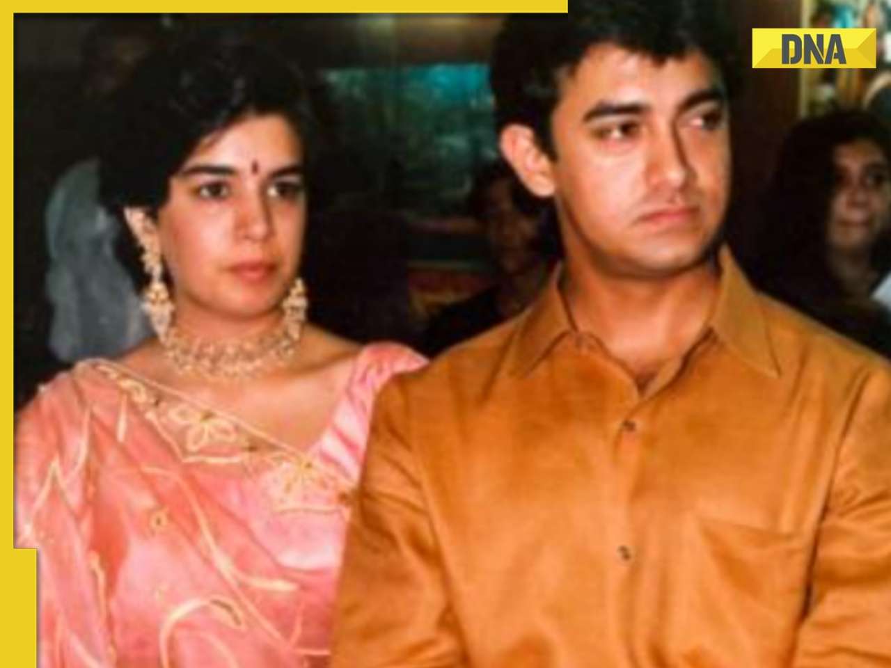
Govinda had tears in his eyes on seeing Arti Singh as bride, Krushna Abhishek reveals: 'Agar woh thodi der...'![submenu-img]() Aamir Khan recalls ex-wife Reena Dutta slapping him when she was in labour: 'She even bit my hand'
Aamir Khan recalls ex-wife Reena Dutta slapping him when she was in labour: 'She even bit my hand'![submenu-img]() Britney Spears settles legal dispute with estranged father Jamie Spears over conservatorship, details inside
Britney Spears settles legal dispute with estranged father Jamie Spears over conservatorship, details inside
- Sports
![submenu-img]() IPL 2024: Sanju Samson, Dhruv Jurel fifties help Rajasthan Royals take down LSG by 7 wickets in Lucknow
IPL 2024: Sanju Samson, Dhruv Jurel fifties help Rajasthan Royals take down LSG by 7 wickets in Lucknow![submenu-img]() IPL 2024 Points table, Orange and Purple Cap list after Delhi Capitals beat Mumbai Indians by 10 runs
IPL 2024 Points table, Orange and Purple Cap list after Delhi Capitals beat Mumbai Indians by 10 runs![submenu-img]() CSK vs SRH, IPL 2024: Predicted playing XI, live streaming details, weather and pitch report
CSK vs SRH, IPL 2024: Predicted playing XI, live streaming details, weather and pitch report![submenu-img]() IPL 2024: Jake Fraser-McGurk, Rasikh Dar power DC to 10-run win over MI
IPL 2024: Jake Fraser-McGurk, Rasikh Dar power DC to 10-run win over MI![submenu-img]() 'If I don’t get a chance despite...': Shubman Gill makes big statement ahead of T20 World Cup 2024
'If I don’t get a chance despite...': Shubman Gill makes big statement ahead of T20 World Cup 2024
- Viral News
![submenu-img]() Viral video: Rediscover childhood bliss with this nostalgic 90s birthday party plate, watch
Viral video: Rediscover childhood bliss with this nostalgic 90s birthday party plate, watch![submenu-img]() Ever seen elephant playing cricket? This viral video will leave you stunned
Ever seen elephant playing cricket? This viral video will leave you stunned![submenu-img]() Mukesh Ambani lost 15 kgs without any workout, his secret diet plan includes...
Mukesh Ambani lost 15 kgs without any workout, his secret diet plan includes...![submenu-img]() Viral video: Groom's daring leap during varmala ceremony leaves internet in stitches, watch
Viral video: Groom's daring leap during varmala ceremony leaves internet in stitches, watch![submenu-img]() Watch: Lioness teaches cubs to climb tree, adorable video goes viral
Watch: Lioness teaches cubs to climb tree, adorable video goes viral


)


)
)
)
)
)
)