
- Home
- Latest News
![submenu-img]() Explainer: Why Spain's PM Pedro Sanchez is taking break from public duties?
Explainer: Why Spain's PM Pedro Sanchez is taking break from public duties?![submenu-img]() Meet superstar who was made to kiss 10 men during audition, feared being called 'difficult', net worth is..
Meet superstar who was made to kiss 10 men during audition, feared being called 'difficult', net worth is..![submenu-img]() Mukesh Ambani's Reliance makes big announcement, unveils new free…
Mukesh Ambani's Reliance makes big announcement, unveils new free…![submenu-img]() Secret Service agent protecting US Vice President Kamala Harris removed after brawl with other officers
Secret Service agent protecting US Vice President Kamala Harris removed after brawl with other officers![submenu-img]() Who is Iranian rapper Toomaj Salehi, why is he sentenced to death? Know on what charges
Who is Iranian rapper Toomaj Salehi, why is he sentenced to death? Know on what charges
- Election 2024
- Webstory
- IPL 2024
- DNA Verified
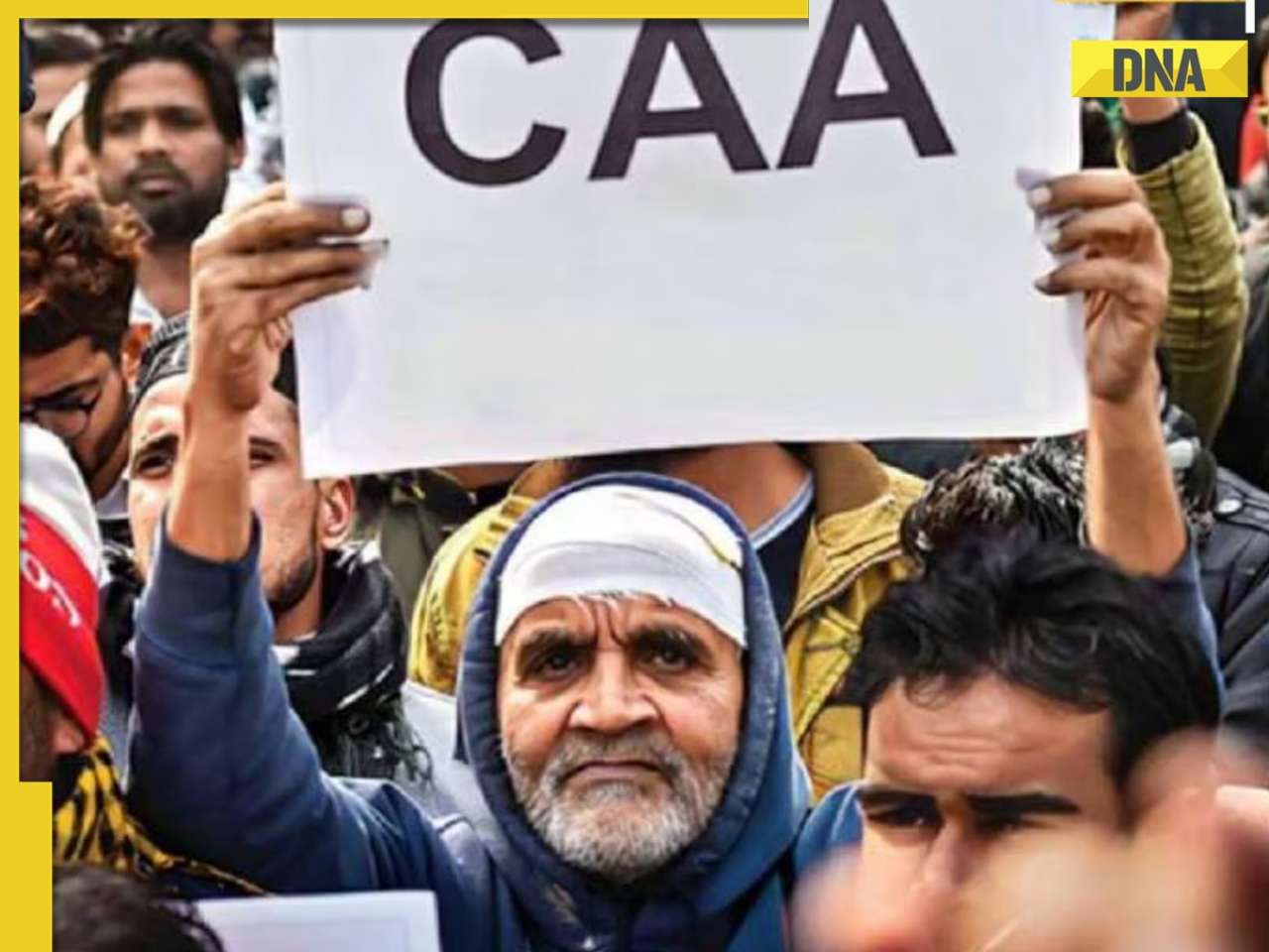
![submenu-img]() DNA Verified: Is CAA an anti-Muslim law? Centre terms news report as 'misleading'
DNA Verified: Is CAA an anti-Muslim law? Centre terms news report as 'misleading'![submenu-img]() DNA Verified: Lok Sabha Elections 2024 to be held on April 19? Know truth behind viral message
DNA Verified: Lok Sabha Elections 2024 to be held on April 19? Know truth behind viral message![submenu-img]() DNA Verified: Modi govt giving students free laptops under 'One Student One Laptop' scheme? Know truth here
DNA Verified: Modi govt giving students free laptops under 'One Student One Laptop' scheme? Know truth here![submenu-img]() DNA Verified: Shah Rukh Khan denies reports of his role in release of India's naval officers from Qatar
DNA Verified: Shah Rukh Khan denies reports of his role in release of India's naval officers from Qatar![submenu-img]() DNA Verified: Is govt providing Rs 1.6 lakh benefit to girls under PM Ladli Laxmi Yojana? Know truth
DNA Verified: Is govt providing Rs 1.6 lakh benefit to girls under PM Ladli Laxmi Yojana? Know truth
- DNA Her
- Photos
![submenu-img]() In pics: Salman Khan, Alia Bhatt, Rekha, Neetu Kapoor attend grand premiere of Sanjay Leela Bhansali's Heeramandi
In pics: Salman Khan, Alia Bhatt, Rekha, Neetu Kapoor attend grand premiere of Sanjay Leela Bhansali's Heeramandi![submenu-img]() Streaming This Week: Crakk, Tillu Square, Ranneeti, Dil Dosti Dilemma, latest OTT releases to binge-watch
Streaming This Week: Crakk, Tillu Square, Ranneeti, Dil Dosti Dilemma, latest OTT releases to binge-watch![submenu-img]() From Salman Khan to Shah Rukh Khan: Actors who de-aged for films before Amitabh Bachchan in Kalki 2898 AD
From Salman Khan to Shah Rukh Khan: Actors who de-aged for films before Amitabh Bachchan in Kalki 2898 AD![submenu-img]() Remember Abhishek Sharma? Hrithik Roshan's brother from Kaho Naa Pyaar Hai has become TV star, is married to..
Remember Abhishek Sharma? Hrithik Roshan's brother from Kaho Naa Pyaar Hai has become TV star, is married to..![submenu-img]() Remember Ali Haji? Aamir Khan, Kajol's son in Fanaa, who is now director, writer; here's how charming he looks now
Remember Ali Haji? Aamir Khan, Kajol's son in Fanaa, who is now director, writer; here's how charming he looks now
- Explainers
![submenu-img]() What is inheritance tax?
What is inheritance tax?![submenu-img]() DNA Explainer: What is cloud seeding which is blamed for wreaking havoc in Dubai?
DNA Explainer: What is cloud seeding which is blamed for wreaking havoc in Dubai?![submenu-img]() DNA Explainer: What is Israel's Arrow-3 defence system used to intercept Iran's missile attack?
DNA Explainer: What is Israel's Arrow-3 defence system used to intercept Iran's missile attack?![submenu-img]() DNA Explainer: How Iranian projectiles failed to breach iron-clad Israeli air defence
DNA Explainer: How Iranian projectiles failed to breach iron-clad Israeli air defence![submenu-img]() DNA Explainer: What is India's stand amid Iran-Israel conflict?
DNA Explainer: What is India's stand amid Iran-Israel conflict?
- Entertainment
![submenu-img]() Meet superstar who was made to kiss 10 men during audition, feared being called 'difficult', net worth is..
Meet superstar who was made to kiss 10 men during audition, feared being called 'difficult', net worth is..![submenu-img]() Lara Dutta has this to say about trolls calling her ‘buddhi, moti’: ‘I don’t know what someone like that…’
Lara Dutta has this to say about trolls calling her ‘buddhi, moti’: ‘I don’t know what someone like that…’![submenu-img]() Meet actress, who gave first Rs 100-crore Tamil film; and it’s not Anushka Shetty, Nayanthara, Jyotika, or Trisha
Meet actress, who gave first Rs 100-crore Tamil film; and it’s not Anushka Shetty, Nayanthara, Jyotika, or Trisha ![submenu-img]() Meet actor, school dropout, who worked as mechanic, salesman, later became star; now earns over Rs 100 crore per film
Meet actor, school dropout, who worked as mechanic, salesman, later became star; now earns over Rs 100 crore per film![submenu-img]() This filmmaker earned Rs 150 as junior artiste, bunked college for work, now heads production house worth crores
This filmmaker earned Rs 150 as junior artiste, bunked college for work, now heads production house worth crores
- Sports
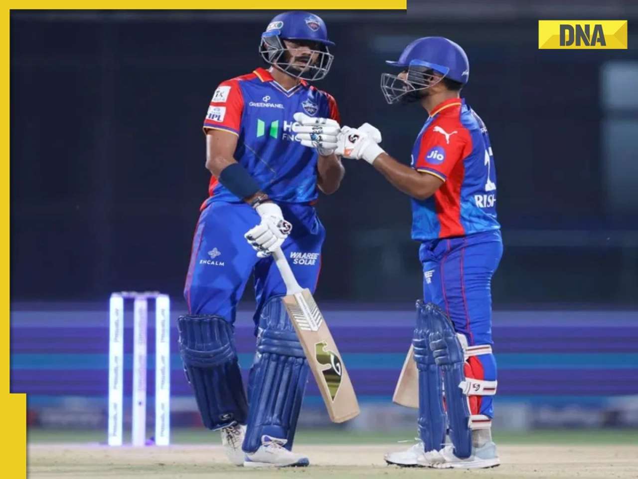
![submenu-img]() IPL 2024: Rishabh Pant, Axar Patel shine as Delhi Capitals beat Gujarat Titans by 4 runs
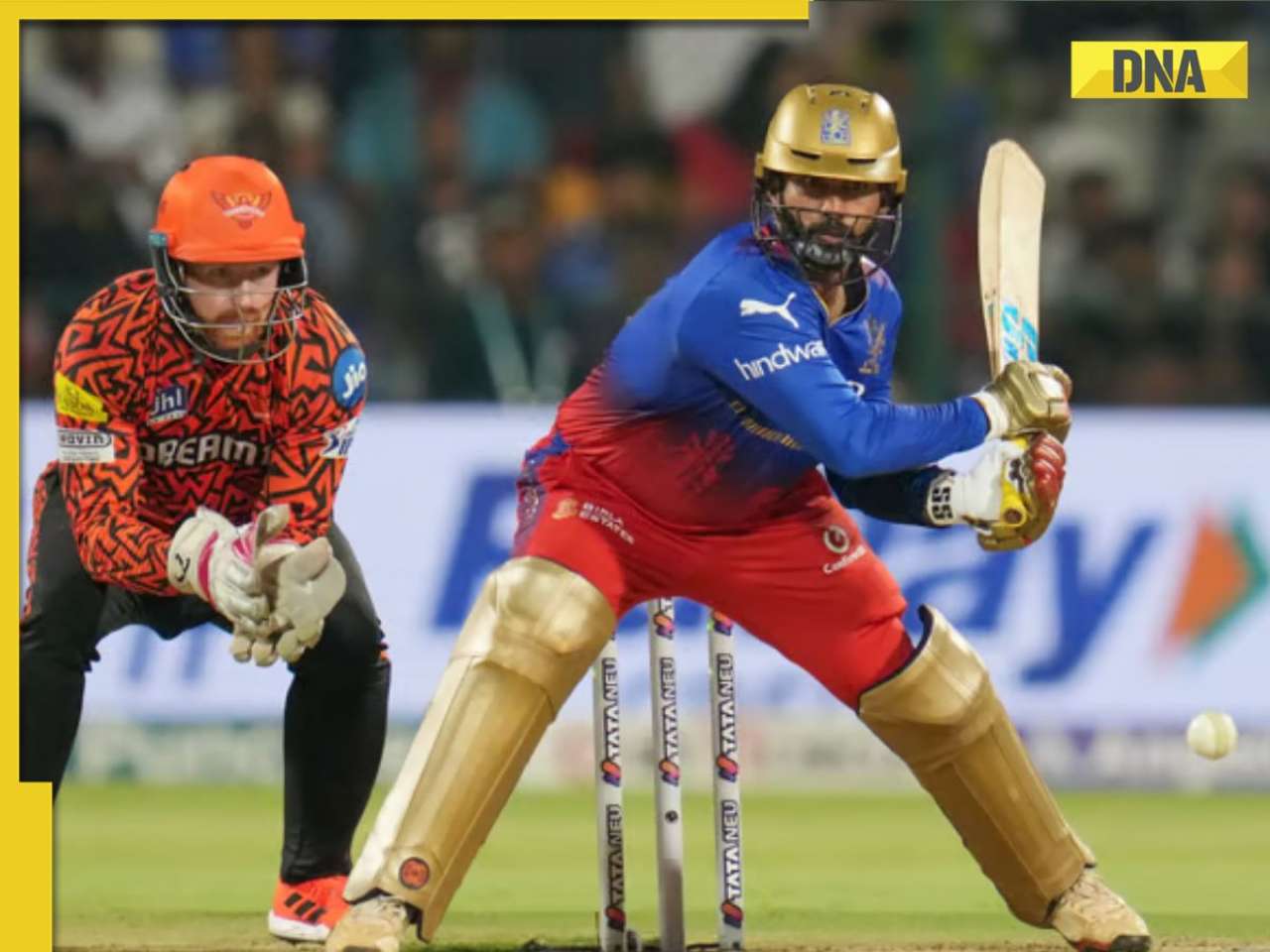
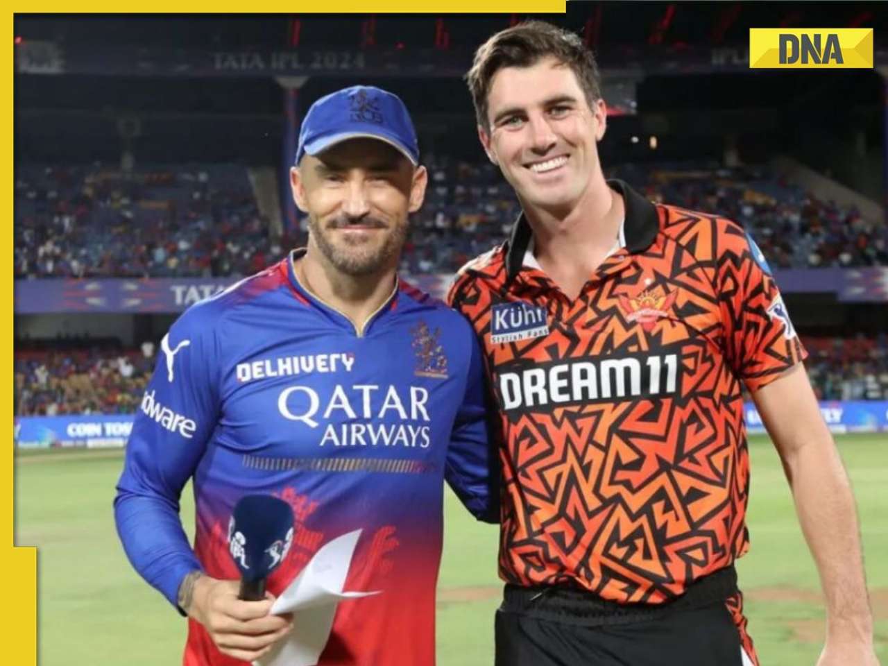
IPL 2024: Rishabh Pant, Axar Patel shine as Delhi Capitals beat Gujarat Titans by 4 runs![submenu-img]() SRH vs RCB, IPL 2024: Predicted playing XI, live streaming details, weather and pitch report
SRH vs RCB, IPL 2024: Predicted playing XI, live streaming details, weather and pitch report![submenu-img]() SRH vs RCB IPL 2024 Dream11 prediction: Fantasy cricket tips for Sunrisers Hyderabad vs Royal Challengers Bengaluru
SRH vs RCB IPL 2024 Dream11 prediction: Fantasy cricket tips for Sunrisers Hyderabad vs Royal Challengers Bengaluru ![submenu-img]() Meet India cricketer who wanted to be IPS officer, got entry in IPL by luck, now earns more than CSK star Dhoni, he is..
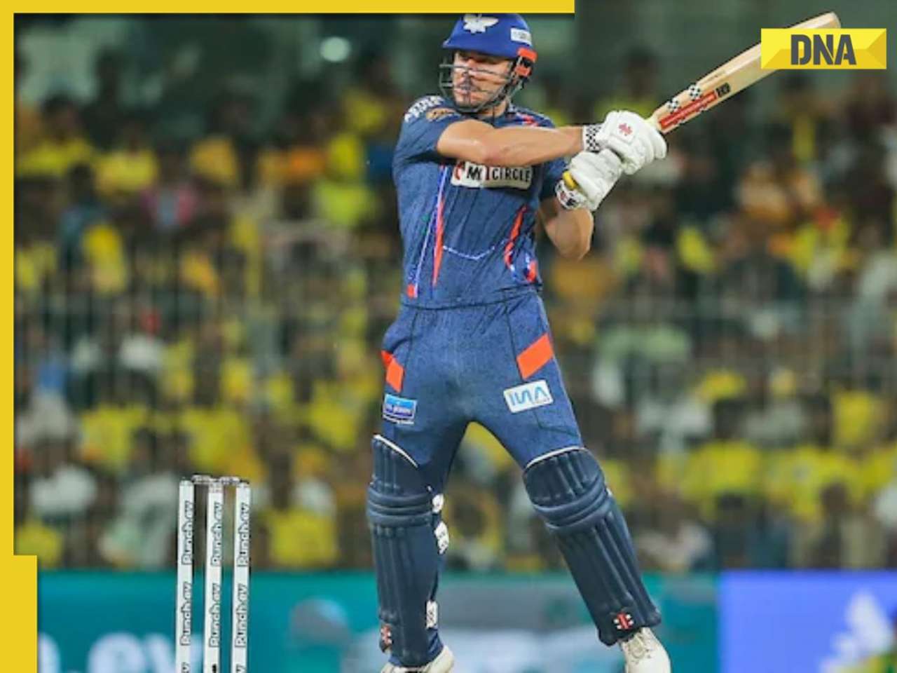
Meet India cricketer who wanted to be IPS officer, got entry in IPL by luck, now earns more than CSK star Dhoni, he is..![submenu-img]() IPL 2024: Marcus Stoinis' century power LSG to 6-wicket win over CSK
IPL 2024: Marcus Stoinis' century power LSG to 6-wicket win over CSK
- Viral News
![submenu-img]() Viral video: Truck driver's innovative solution to beat the heat impresses internet, watch
Viral video: Truck driver's innovative solution to beat the heat impresses internet, watch![submenu-img]() 'Look between E and Y on your keyboard': All you need to know about new 'X' trend
'Look between E and Y on your keyboard': All you need to know about new 'X' trend![submenu-img]() Watch: Pet dog scares off alligator in viral video, internet reacts
Watch: Pet dog scares off alligator in viral video, internet reacts![submenu-img]() Professional Indian gamers earn unbelievable amounts of money amid gaming boom; Know about their annual earnings
Professional Indian gamers earn unbelievable amounts of money amid gaming boom; Know about their annual earnings![submenu-img]() Meet first Asian woman without arms to get driving licence, she is from...
Meet first Asian woman without arms to get driving licence, she is from...


)
)
)
)
)


)
)
)
)
)
)