
- Home
- Latest News
![submenu-img]() Rakesh Jhunjhunwala’s wife sold 734000 shares of this Tata stock, reduced stake in…
Rakesh Jhunjhunwala’s wife sold 734000 shares of this Tata stock, reduced stake in…![submenu-img]() West Bengal: Ram Navami procession in Murshidabad disrupted by explosion, stone-pelting, BJP reacts
West Bengal: Ram Navami procession in Murshidabad disrupted by explosion, stone-pelting, BJP reacts![submenu-img]() 'We certainly support...': US on Elon Musk's remarks on India's permanent UNSC seat
'We certainly support...': US on Elon Musk's remarks on India's permanent UNSC seat![submenu-img]() Adil Hussain regrets doing Sandeep Reddy Vanga’s Kabir Singh, says it makes him feel small: ‘I walked out…’
Adil Hussain regrets doing Sandeep Reddy Vanga’s Kabir Singh, says it makes him feel small: ‘I walked out…’![submenu-img]() Deepika Padukone's worst film was delayed for 9 years, panned by critics, called cringefest, still earned Rs 400 crore
Deepika Padukone's worst film was delayed for 9 years, panned by critics, called cringefest, still earned Rs 400 crore
- Election 2024
- Webstory
- IPL 2024
- DNA Verified
![submenu-img]() DNA Verified: Is CAA an anti-Muslim law? Centre terms news report as 'misleading'
DNA Verified: Is CAA an anti-Muslim law? Centre terms news report as 'misleading'![submenu-img]() DNA Verified: Lok Sabha Elections 2024 to be held on April 19? Know truth behind viral message
DNA Verified: Lok Sabha Elections 2024 to be held on April 19? Know truth behind viral message![submenu-img]() DNA Verified: Modi govt giving students free laptops under 'One Student One Laptop' scheme? Know truth here
DNA Verified: Modi govt giving students free laptops under 'One Student One Laptop' scheme? Know truth here![submenu-img]() DNA Verified: Shah Rukh Khan denies reports of his role in release of India's naval officers from Qatar
DNA Verified: Shah Rukh Khan denies reports of his role in release of India's naval officers from Qatar![submenu-img]() DNA Verified: Is govt providing Rs 1.6 lakh benefit to girls under PM Ladli Laxmi Yojana? Know truth
DNA Verified: Is govt providing Rs 1.6 lakh benefit to girls under PM Ladli Laxmi Yojana? Know truth
- DNA Her
- Photos
![submenu-img]() In pics: Rajinikanth, Kamal Haasan, Mani Ratnam, Suriya attend S Shankar's daughter Aishwarya's star-studded wedding
In pics: Rajinikanth, Kamal Haasan, Mani Ratnam, Suriya attend S Shankar's daughter Aishwarya's star-studded wedding![submenu-img]() In pics: Sanya Malhotra attends opening of school for neurodivergent individuals to mark World Autism Month
In pics: Sanya Malhotra attends opening of school for neurodivergent individuals to mark World Autism Month![submenu-img]() Remember Jibraan Khan? Shah Rukh's son in Kabhi Khushi Kabhie Gham, who worked in Brahmastra; here’s how he looks now
Remember Jibraan Khan? Shah Rukh's son in Kabhi Khushi Kabhie Gham, who worked in Brahmastra; here’s how he looks now![submenu-img]() From Bade Miyan Chote Miyan to Aavesham: Indian movies to watch in theatres this weekend
From Bade Miyan Chote Miyan to Aavesham: Indian movies to watch in theatres this weekend ![submenu-img]() Streaming This Week: Amar Singh Chamkila, Premalu, Fallout, latest OTT releases to binge-watch
Streaming This Week: Amar Singh Chamkila, Premalu, Fallout, latest OTT releases to binge-watch
- Explainers
![submenu-img]() DNA Explainer: What is cloud seeding which is blamed for wreaking havoc in Dubai?
DNA Explainer: What is cloud seeding which is blamed for wreaking havoc in Dubai?![submenu-img]() DNA Explainer: What is Israel's Arrow-3 defence system used to intercept Iran's missile attack?
DNA Explainer: What is Israel's Arrow-3 defence system used to intercept Iran's missile attack?![submenu-img]() DNA Explainer: How Iranian projectiles failed to breach iron-clad Israeli air defence
DNA Explainer: How Iranian projectiles failed to breach iron-clad Israeli air defence![submenu-img]() DNA Explainer: What is India's stand amid Iran-Israel conflict?
DNA Explainer: What is India's stand amid Iran-Israel conflict?![submenu-img]() DNA Explainer: Why Iran attacked Israel with hundreds of drones, missiles
DNA Explainer: Why Iran attacked Israel with hundreds of drones, missiles
- Entertainment
![submenu-img]() Adil Hussain regrets doing Sandeep Reddy Vanga’s Kabir Singh, says it makes him feel small: ‘I walked out…’
Adil Hussain regrets doing Sandeep Reddy Vanga’s Kabir Singh, says it makes him feel small: ‘I walked out…’![submenu-img]() Deepika Padukone's worst film was delayed for 9 years, panned by critics, called cringefest, still earned Rs 400 crore
Deepika Padukone's worst film was delayed for 9 years, panned by critics, called cringefest, still earned Rs 400 crore![submenu-img]() India's first female villain was called Pak spy; married at 14, became mother at 16, left family to run away with star
India's first female villain was called Pak spy; married at 14, became mother at 16, left family to run away with star![submenu-img]() Dibakar Banerjee says people didn’t care when Sushant Singh Rajput died, only wanted ‘spicy gossip’: ‘Everyone was…'
Dibakar Banerjee says people didn’t care when Sushant Singh Rajput died, only wanted ‘spicy gossip’: ‘Everyone was…'![submenu-img]() Most watched Indian film sold 25 crore tickets, was still called flop; not Baahubali, Mughal-e-Azam, Dangal, Jawan, RRR
Most watched Indian film sold 25 crore tickets, was still called flop; not Baahubali, Mughal-e-Azam, Dangal, Jawan, RRR
- Sports
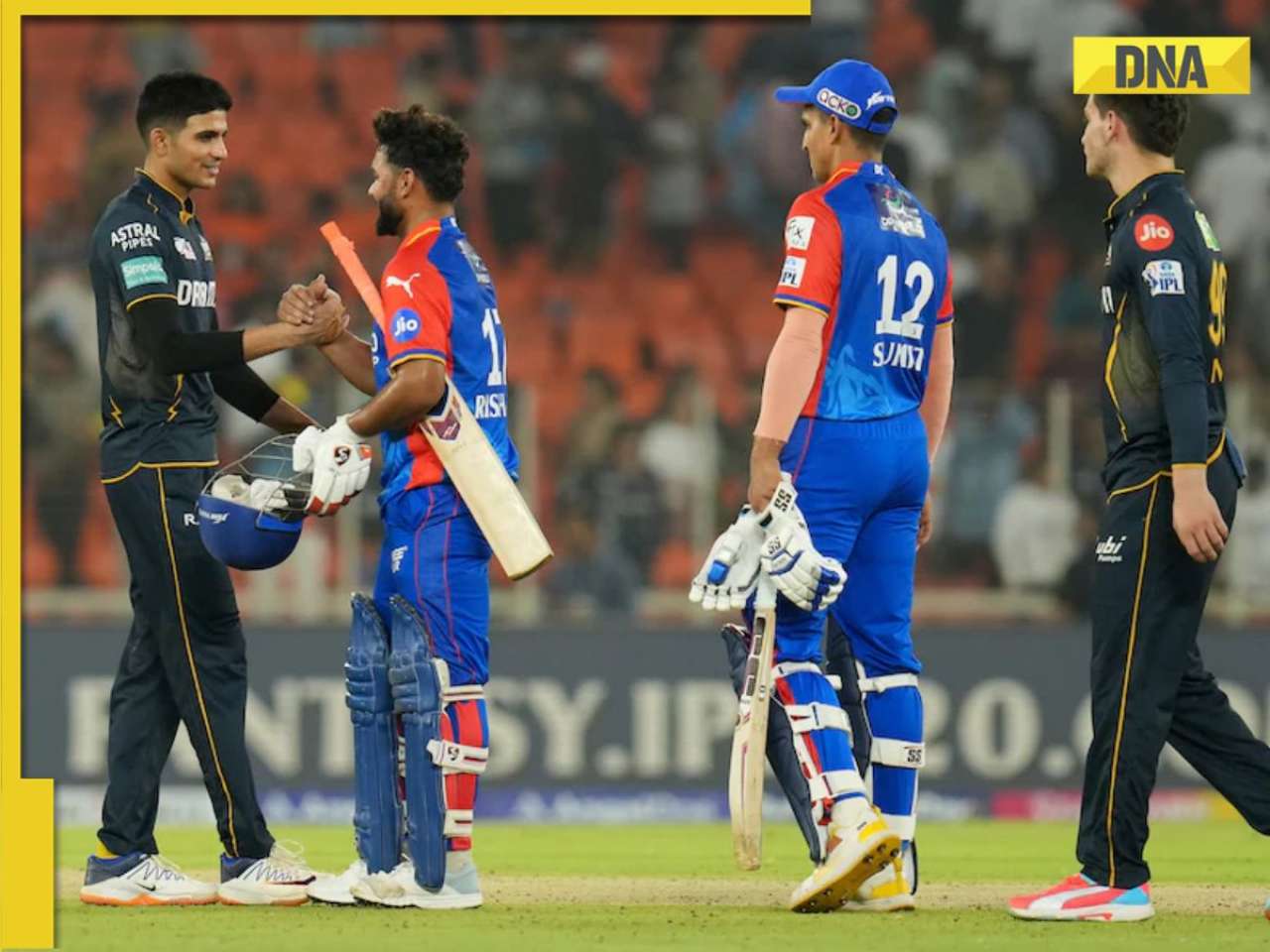
![submenu-img]() IPL 2024: DC thrash GT by 6 wickets as bowlers dominate in Ahmedabad
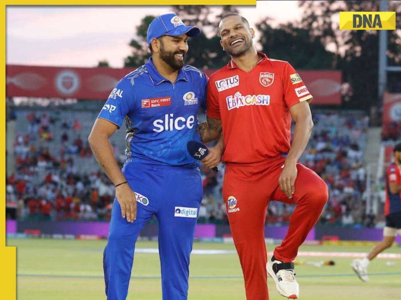
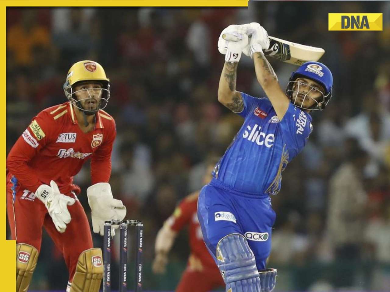
IPL 2024: DC thrash GT by 6 wickets as bowlers dominate in Ahmedabad![submenu-img]() MI vs PBKS, IPL 2024: Predicted playing XI, live streaming details, weather and pitch report
MI vs PBKS, IPL 2024: Predicted playing XI, live streaming details, weather and pitch report![submenu-img]() MI vs PBKS IPL 2024 Dream11 prediction: Fantasy cricket tips for Mumbai Indians vs Punjab Kings
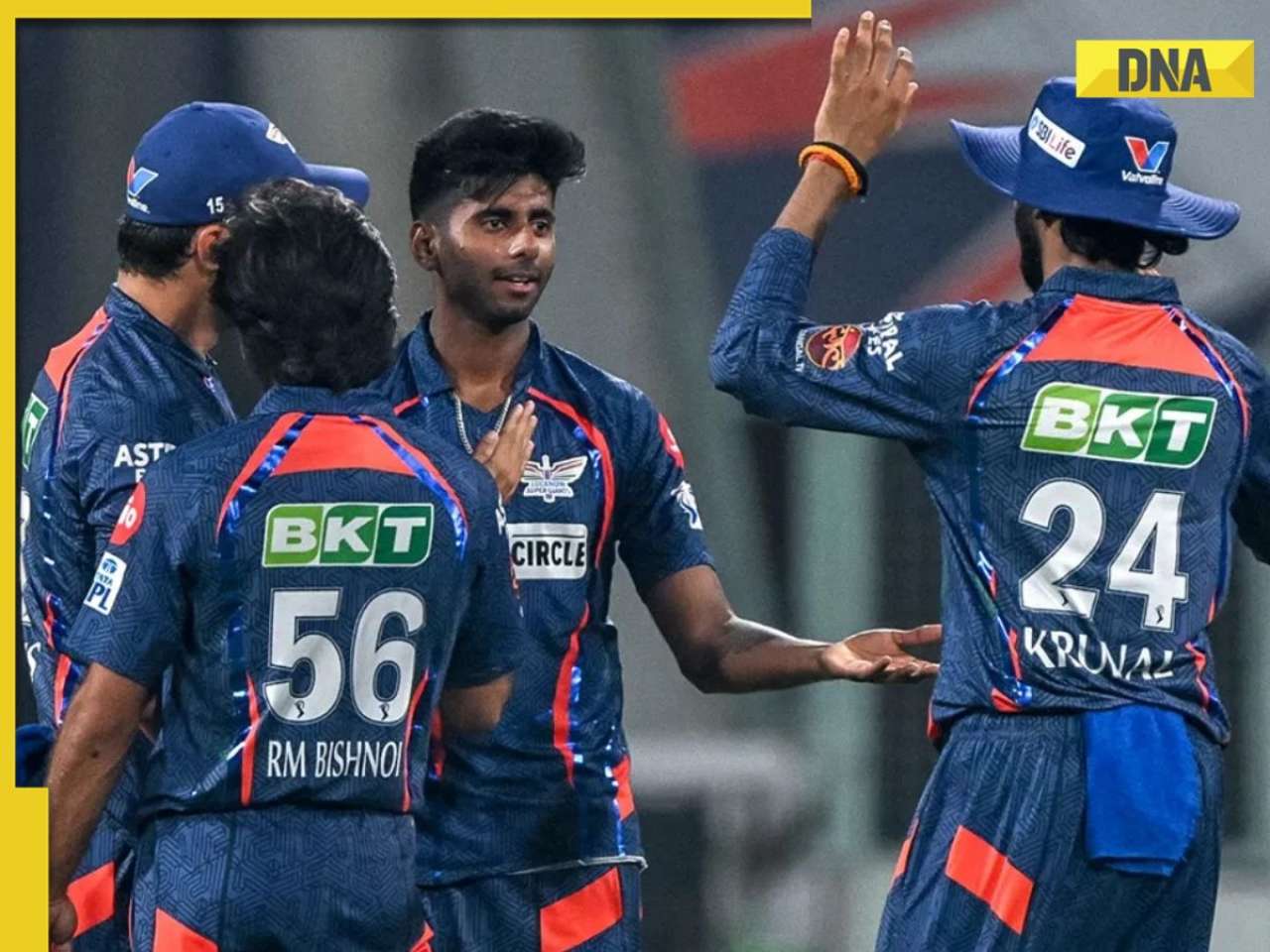
MI vs PBKS IPL 2024 Dream11 prediction: Fantasy cricket tips for Mumbai Indians vs Punjab Kings ![submenu-img]() IPL 2024: Big boost for LSG as star pacer rejoins team, check details
IPL 2024: Big boost for LSG as star pacer rejoins team, check details![submenu-img]() IPL 2024: Jos Buttler's century power RR to 2-wicket win over KKR
IPL 2024: Jos Buttler's century power RR to 2-wicket win over KKR
- Viral News
![submenu-img]() This Swiss Alps wedding outshine Mukesh Ambani's son Anant Ambani's Jamnagar pre-wedding gala
This Swiss Alps wedding outshine Mukesh Ambani's son Anant Ambani's Jamnagar pre-wedding gala![submenu-img]() Watch viral video: Deserts around Saudi Arabia's Mecca and Medina are turning green due to…
Watch viral video: Deserts around Saudi Arabia's Mecca and Medina are turning green due to…![submenu-img]() Shocking details about 'Death Valley', one of the world's hottest places
Shocking details about 'Death Valley', one of the world's hottest places![submenu-img]() Aditya Srivastava's first reaction after UPSC CSE 2023 result goes viral, watch video here
Aditya Srivastava's first reaction after UPSC CSE 2023 result goes viral, watch video here![submenu-img]() Watch viral video: Isha Ambani, Shloka Mehta, Anant Ambani spotted at Janhvi Kapoor's home
Watch viral video: Isha Ambani, Shloka Mehta, Anant Ambani spotted at Janhvi Kapoor's home


 "LinkedIn, LinkedIn redesign, LinkedIn new design, LinkedIn desktop, LinkedIn app, LinkedIn desktop update, Web Exclusive, Trend")


)
)
)
)
)
)